
Six multi-color quartz blends dominate modern interior specifications: warm beige-and-cream (greige), classic grey-and-white, black with gold flecks, blue-grey, sage green-grey, and terracotta-and-sand — and warm neutrals lead by a clear margin. In our own shipment mix at Apex, warm beige-and-cream and grey-and-white blends together account for roughly 70% of multi color quartz slab volume, with the four accent families sharing the remainder. That tracks the wider market: Better Homes & Gardens’ 2026 kitchen colour coverage keeps returning to warm neutrals and layered taupes as the direction of the decade, and the multi-color blends that sell best are precisely the ones engineered to deliver that layered, natural-stone feeling without natural stone’s maintenance.
A blend is not just “colourful quartz.” It is a deliberate recipe of quartz grains in several screened sizes and tones, pigment, and — in the premium versions — mirror and metallic flecks, mixed so the finished slab reads as depth rather than noise. Because a well-engineered blend mimics the mineral scatter of real granite and quartzite, it hides daily wear, seams, and water spots far better than any solid colour — which is the practical reason multi-color blends have overtaken plain white in renovation-heavy markets. This guide is a working catalogue: the six families worth specifying, the grain recipes behind them, the room and light pairings that flatter each one, and the five checks I insist on before a bulk order ships.
TL;DR
- Warm beige-and-cream is the volume leader and the safest blend for resale-focused projects; grey-and-white dominates commercial fit-outs where neutrality is a requirement, not a preference.
- Every blend is built from three controllable variables — grain colour mix ratio, grain size distribution, and mirror-fleck loading — which is why the same colour name can look different from two factories.
- Light decides the blend: warm families hold tone under both warm LED and north light, while blue-grey and black blends shift cool in diffused daylight.
- Approve blends from two production dates, not one showroom chip, because batch-to-batch grain distribution is the largest source of colour complaints on container orders.
- Premium flecked blends carry a 5–15% price premium over solid tones; standard beige-and-grey blends usually price the same as solids from the same factory.
Why Multi-Color Blends Lead the 2026 Palette
Two forces pushed blends to the front of the specification list, one aesthetic and one practical. The aesthetic driver is the warm-neutral cycle. After a decade of cool greys and stark whites, the dominant palettes now layer warm beiges, mushroom tones, and soft golds — the direction Better Homes & Gardens documents across its 2026 kitchen colour trend reporting. Multi-color blends are the engineered-stone answer to that palette, because a blend can carry three or four warm tones in one surface while a solid colour can carry only one.
The practical driver is maintenance tolerance. A solid white surface shows every crumb, watermark, and seam adhesive; a grain blend scatters light at the mineral level and visually absorbs all of it. Because the grain structure breaks up reflections the way natural stone does, blends keep looking clean between wipe-downs — which is why families with children and hospitality projects with hard daily traffic consistently move from solids to blends and rarely move back. Natural stone offers the same visual depth, but the Natural Stone Institute’s care guidance makes clear what that depth costs in sealing and pH-sensitive cleaning; engineered blends deliver the depth without the ritual.
There is also a colour-personality shift worth naming. Better Homes & Gardens’ coverage of the NKBA’s 2026 research shows greens and blues rising alongside the neutral base — a market that wants personality without committing to a loud solid colour. A sage green-grey blend or a blue-grey blend answers exactly that brief: read as colour at a distance, read as stone up close. Because a blend dilutes a hue into a field of neutral grains, it delivers colour at half the commitment of a solid-tone slab — which is how cautious buyers end up with green kitchens anyway.
The Six Blend Families Worth Specifying
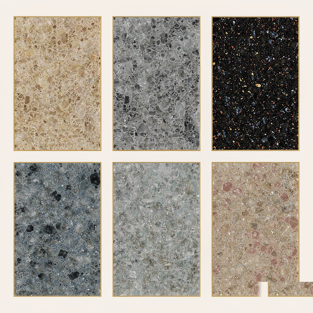
Treat these as families rather than SKUs: every factory interprets them, and within a family the recipe variables — grain ratio, size distribution, fleck loading — do the differentiating. Percentages below describe the grain mix as we formulate it; other mills’ versions sit within a few points of these ranges.
1. Warm Beige-and-Cream (Greige)
The volume leader across residential projects. Our formulation runs roughly 60–70% cream and fine sand-toned grains over 30–40% translucent grey-beige quartz grains, with 2–3% fine mirror fleck to keep the surface alive under kitchen lighting. The appeal is chameleon behaviour: against white shaker cabinetry it reads warm white, against walnut flat panels it reads greige, and against both it photographs well. Because the cream base reflects 10–15% more light than a mid-grey blend, it is the blend that flatters small kitchens and north-facing rooms where light is the scarcest material. It is also the blend most sensitive to resin yellowing, so verify UV-stable resin if the order includes window-adjacent vanities.
2. Classic Grey-and-White
The commercial workhorse: a 50/50 to 60/40 split of white and mid-grey grains in a 2–4 mm dominant grain size, usually with no fleck. Specifiers choose it because it is the one blend that survives tenant turnover, franchise rebrands, and resale — neutral by definition. In our export mix it dominates office kitchens, multi-unit residential, and retail fit-outs. Because grey-and-white hides seam adhesive tone shifts better than any dark or warm blend, it is the right default wherever slab runs exceed 3200 mm and joints are unavoidable. The risk to manage is coldness in north light, where the grey fraction dominates visually.
3. Black with Gold Flecks
The accent family: a black-pigmented base carrying 5–8% gold-toned metallic and amber glass flecks, often paired with a fine white-gold veining print in the premium versions. Used for islands, bar fronts, and feature vanities rather than full kitchens, because at full-room scale the 3–6% fleck loading reads as sparkle under directed light but as dust under diffused light. Because black blends show hard-water spots and dust within hours, they reward households with daily wipe discipline — and punish hospitality back-of-house, where we steer those projects to grey-and-white instead. In a polished finish against walnut or brushed brass, nothing in the engineered-stone range photographs richer.
4. Blue-Grey
The modern-market family: cool mid-grey grains blended with 15–25% soft blue-toned quartz and a fine silver fleck at 1–2%. It is the blend most tied to contemporary cabinetry — it turns almost pewter against matte navy fronts and almost silver against white. It is also the blend with the least light forgiveness. Because the blue fraction only reads as blue under 4000 K and cooler light, blue-grey blends can shift to flat grey under warm 2700 K LEDs — always approve the sample under the project’s actual lighting, not the showroom’s. In south- and west-facing rooms with strong afternoon light it performs beautifully.
5. Sage Green-Grey
The fastest-rising family, tracking the green movement in the NKBA-reported palettes: 20–30% muted sage-green grains dispersed through a grey-and-cream field, typically grain sizes under 3 mm for a soft, textile-like read. Sage blends are the bridge buyers choose when they want colour but not commitment — at two metres the surface reads green; at arm’s length it reads stone. Because the green grains sit in a neutral field rather than a green base, the blend changes character with cabinetry instead of fighting it, which is why designers specify it for kitchens planned to be repainted twice in a decade. Pair it with unlacquered brass or oak and the surface warms; pair it with black and it cools into almost military grey.
6. Terracotta-and-Sand
The hospitality family: rust, clay, and sand-toned grains over a warm cream base at 25–35% colour loading, sometimes with a 1–2% copper fleck. In restaurants and hotel lobby bars it delivers the warmth of travertine and sandstone with none of the porosity, and under 2700–3000 K tungsten-equivalent lighting — where most hospitality operates — it glows rather than flattens. Because warm artificial light drains blue and green blends but enriches red-family grains, terracotta blends are the only colour family that looks better at 9 p.m. under a bar pendant than it does in daylight. In residential work, treat it as an accent: powder-room vanity tops, butler’s pantry counters, fireplace surrounds.
What Actually Creates a Blend: Grains, Pigments, and Flecks
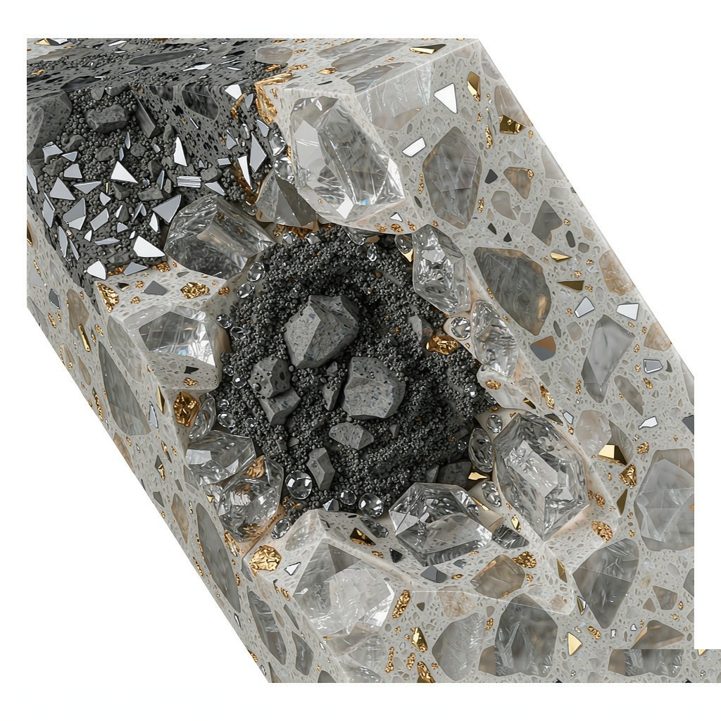
Every engineered quartz slab — blend or solid — starts with roughly 90–93% quartz aggregate by mass bound in 7–10% resin and pigment, vibro-compacted under vacuum and cured at controlled temperature. The blend is created upstream of all of that, in the weighing and mixing stage, and this is where the three variables live.
The first variable is the grain colour mix ratio: the percentage by mass of each toned aggregate in the batch. A 5% swing in the beige fraction of a greige blend is visible to a trained eye across a seam, which is why our batches are weighed to 0.5% tolerance and locked per colour code. The second is grain size distribution: the blend of coarse, medium, and fine fractions. Coarse grains (4–6 mm) create visual drama but weaken edge detail on routed profiles; fine grains under 1 mm create soft, uniform surfaces that can read as flat at scale. Because grain size controls both the visual texture and the mechanical edge quality, the distribution curve is the single most guarded number in a blend’s recipe. The third is mirror-fleck loading: glass and metallic flakes at 0.5–8% by mass, fully encapsulated by resin during compaction so they never catch dirt or cleaning cloth. Fleck percentage above roughly 8% stops adding sparkle and starts adding cost.
The physical result is a dense, non-porous body — density around 2.4 g/cm³ and water absorption below 0.05% when tested to the ASTM C97 methods — which is what allows blends to promise the warm look of sandstone with the cleaning routine of glass. Because the resin seals every grain boundary during vacuum compaction, the blend’s visual complexity never becomes cleaning complexity: there is no porosity gradient between the cream grains and the grey ones. That single sentence is the whole value proposition of the category, and it is why blends have taken share from both solid quartz and natural stone simultaneously.
Matching Blends to Rooms and Light
Choosing a blend from a 100 mm showroom chip under retail lighting is the most common specification error we see, and it is entirely avoidable. Light temperature, direction, and intensity change every blend family differently, because each family’s colour fraction responds to a different part of the spectrum.
| Blend family | Best rooms | Best light | Caution |
|---|---|---|---|
| Warm beige-and-cream | Kitchens, small baths, north-facing rooms | Warm LED and north light both | Verify UV-stable resin near windows |
| Grey-and-white | Commercial kitchens, rentals, long runs with seams | Any; add warmth via lighting | Reads coldest in north light |
| Black with gold flecks | Islands, bars, feature vanities | Directed task and pendant light | Shows water spots and dust quickly |
| Blue-grey | Contemporary kitchens, south- and west-facing rooms | 4000 K+ or strong daylight | Flattens under 2700 K warm LEDs |
| Sage green-grey | Family kitchens, repaintable rooms | Diffused daylight, warm or neutral LEDs | Green reads stronger at distance |
| Terracotta-and-sand | Hospitality, bars, powder rooms | 2700–3000 K tungsten-equivalent | Too warm as a full-room residential spec |
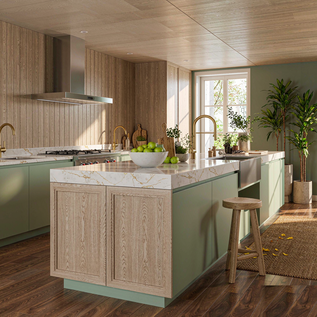
Two practical rules cover most projects. First, match the blend’s warmth direction to the room’s fixed elements, not its paint — paint changes, oak floors and black windows do not. Because cabinetry and flooring are the two finishes the countertop touches, a blend whose undertone conflicts with either will look wrong no matter how good its recipe is. Second, approve samples at the actual light temperature the room will run: a 2700 K evening-lit open-plan kitchen rejects blends that sing under 5000 K showroom tubes, and blue-grey is the family most often sent back for exactly this reason.
Five Checks Before You Order a Multi-Color Blend
These are the checks our own team runs before countersigning a bulk order, whether it is eight slabs for one kitchen or a container for a multi-unit project.
- Approve two production-date samples together. Batch-to-batch grain distribution is the largest source of colour complaints, so compare two slabs or full-size samples from different dates under the same daylight lamp. A commercial tolerance of roughly ΔE 1.5 between them is reasonable; more than that, ask which batch your order will come from.
- Test the sample under the project’s lighting, both day and night. A blend that works under daylight tubes can shift a full family cooler or warmer under the room’s actual LEDs. Ten minutes with the sample and the specified lamps prevents the most disappointing delivery in this category.
- Confirm grain orientation if the project includes islands or waterfall edges. Directional blends — sage, blue-grey, terracotta — show grain flow, so adjacent pieces need to be cut with orientation in mind. Request the fabricator’s layout drawing before the slabs are cut, not after.
- Check the fleck loading in the actual finish. Fleck percentage that looks rich in polished can nearly vanish in a honed or matte finish, because the sparkle depends on a reflective surface. If the project specifies honed, re-approve against a honed sample.
- Reserve the batch balance for follow-on phases. Because each blend batch is a unique statistical mix, a phase-two order six months later will match, but not perfectly. If the project has a second phase, reserve slab quantity from the same batch at order time.
Frequently Asked Questions
Specify the Recipe, Not the Name
Every blend family above succeeds for the same underlying reason: it converts engineered consistency into the appearance of natural randomness, and the projects that fail are the ones that treated a blend like a paint code instead of a recipe. Approve the batch, not the brochure; test under the room’s own lights; match warmth direction to the fixed finishes; and reserve batch balance for phase two. Do those four things and the blend you receive is the blend you approved.
Apex Quartz Stone has manufactured engineered stone since 1997 from a 40,000 m² facility in Shuitou, Nan’an, producing more than 100,000 slabs a year for buyers in over 20 countries — nearly three decades of blend recipes shipped through our own lines. If you are weighing blend families for a residential, commercial, or multi-unit project, our technical team will send full-size samples from current batches, confirm the grain recipe for your specified colour codes, and reserve batch balance for follow-on phases. Browse the multi color quartz slab range or the wider engineered quartz stone collection to start, then tell us the room, the cabinetry, and the lighting — we will match the blend before the order ships, not after.
Alex Wang
Alex Wang has worked in engineered stone exports since 2014 and advises importers, fabricators, and developers on slab specification across more than 20 markets. Apex Quartz Stone (Quanzhou APEX Co., Ltd.) has manufactured engineered stone since 1997. Connect on LinkedIn.
Post time: Sep-28-2026