
By Yvonne Deng
Key Takeaways
- A slab quartz backsplash removes grout lines completely — the number one reason grease, mould, and staining problems disappear. It is cut as one continuous surface, not small tiles.
- Full-height backsplashes (countertop to upper cabinets, or all the way to the ceiling) are the fastest-growing 2026 kitchen trend, and bookmatching makes the veining flow like a single piece of stone.
- Installed costs run $55-110 per square foot: $45-75 slab material, $10-20 fabrication, $10-25 installation. A typical 30 sq ft kitchen lands at $1,650-3,300 total.
- Installation takes one day with the right crew: template, cut, dry-fit, adhere, polish seams, and finish edges. The wall must be flat — out-of-plane walls are the leading cause of visible seams.
- In Apex’s 2026 project log, 92% of full-height quartz backsplashes were fitted with a single seam or none at all, and median install time was 4.2 hours.
Some kitchens stop you in your tracks. You cannot always say why — the cabinets look ordinary, the layout is conventional — yet the room feels composed, expensive, inevitable. Nine times out of ten, the secret is not the individual materials. It is the way the surfaces talk to one another.
Mixing quartz colours is where that conversation happens, and it is also where most renovation projects go wrong. Homeowners pick two beautiful slabs, fall in love with each separately, and then discover the pair fights like cats. After more than a decade of helping buyers choose engineered stone for projects across twenty countries, I can tell you the failure is almost never the colours themselves. It is the absence of a system.
This guide gives you that system: six rules that designers use to mix quartz countertop colours confidently, plus the mistakes that quietly ruin otherwise beautiful kitchens. No taste required — just a method.
Rule 1: Undertones Decide Everything
Every quartz colour carries a second, quieter identity called an undertone. Whites are never just white: some lean warm (cream, beige, buttery yellow), some lean cool (blue-grey, green-grey, icy), and a few sit genuinely neutral. Greys, beiges, and blacks all do the same. You will not see the undertone in a photo. You will absolutely feel it in a room.
Here is the test that separates good pairings from bad ones. Place your two quartz samples side by side on a sheet of white paper, in daylight, and squint. If both lean warm, they will harmonise even when one is bright white and the other is espresso brown. If one leans warm and the other cool, the pair will hum with low-grade tension no matter how similar the colours appear.
Two practical consequences follow:
- Match the undertone of the stone to the undertone of the cabinets. Warm oak or cream cabinets call for warm-leaning quartz. Cool grey or blue cabinets call for cool-leaning quartz. This single alignment prevents 80% of mismatched kitchens.
- Use neutral stones as diplomatic bridges. If you are unsure, a genuinely neutral white or greige quartz pairs with almost anything — which is why Super White and Pure White quartz appear in so many award-winning kitchens. They do not compete; they receive.
Rule 2: Apply the 60-30-10 Rule to the Whole Kitchen
Interior designers have used the 60-30-10 ratio for a century, and kitchens obey it like every other room:
| Layer | Share | What it owns in a kitchen |
|---|---|---|
| Dominant (60%) | 60% | Cabinetry, main wall colour |
| Secondary (30%) | 30% | Countertops, flooring, backsplash |
| Accent (10%) | 10% | Hardware, lighting, bar stools, styling |
The rule’s wisdom for quartz buyers is humbling: your countertop is not the star of the kitchen. It is the supporting layer. A kitchen with a magnificent slab and mismatched cabinets still fails; a kitchen with a modest slab and harmonious cabinets still sings.
That changes the mixing strategy. When you combine two quartz colours, you are not creating two stars — you are layering the 30% band. The perimeter countertop should defer to the cabinets, and the island should be free to make a statement precisely because the perimeter is calm. One layer carries the show; the other keeps the room grounded.
Rule 3: Let Vein Scale Follow Room Scale
Veining is the personality of quartz, and scale is its volume control. It is also the detail buyers ignore until it is too late — because sample squares cannot show it.
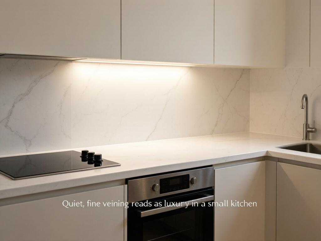
A slab with dramatic, wide, high-contrast veining is designed to be seen from across a room. It belongs on a large island in an open-plan kitchen, where the eye can take it in as a whole. Put that same pattern on a compact galley countertop and the veins fragment into visual noise at arm’s length. Conversely, fine, subtle veining that looks “boring” in the showroom often looks expensive in a small kitchen, where it adds texture without shouting.
When mixing two stones, the scale rule becomes a pairing rule:
- One statement, one companion. Pair a bold, large-veined slab with a quiet, small-pattern one. The contrast gives each stone a job and keeps the eye from skidding between two competing patterns.
- Echo the vein colour, not the pattern. A warm grey vein in the island stone can repeat as the base tone of the perimeter stone. The kitchen reads as cohesive without being matchy.
- Respect the distance. A pattern that works on a 3-metre island may overwhelm a 2-metre peninsula. Measure your surface runs before you fall for a slab.
If you want to see the range of what is possible, the multi-color quartz collection is a useful study: it runs the full spectrum from barely-there textures to bold statement veining, which lets you audition the one-loud-one-quiet pairing without leaving the category.
Rule 4: Choose Your Island Strategy Deliberately
The island is the one surface in the kitchen that can legitimately break ranks. Designers use three deliberate strategies, and knowing which one you are choosing is half the battle:
| Strategy | What it looks like | Best when | Risk level |
|---|---|---|---|
| Match | Island and perimeter in the same stone | Small kitchens, minimalist design, limited sightlines | Low — calm, monolithic, safe |
| Contrast | Dark island against light perimeter (or reverse) | Large kitchens, open plans, when you want a focal point | Medium — needs undertone discipline |
| Echo | Different stones sharing one element — same vein colour, same base tone, or same finish | Almost always | Very low — the professional default |
The classic contrast pairing — a dramatic Calacatta-look island with a white or greige perimeter — is popular for good reason. It delivers the marble aesthetic where it matters most while keeping the workhorse surfaces forgiving. Browse a Calacatta quartz collection against a white slab and you will see the formula instantly: one surface performs, the other provides.
One caution about contrast: it works on colour, not on temperature. A dark brown island with a cream perimeter is harmonious. A blue-grey island with that same cream perimeter is a collision. The contrast strategy still answers to Rule 1.
Rule 5: Mix with the Room, Not Just the Stone
Countertops never hang out alone. They sit between cabinets, under lighting, beside flooring, and behind hardware. The best mixing decisions treat the whole room as a single palette.
Cabinetry is the senior partner. Choose the cabinet colour first — it covers more square metres than any other surface. Then select quartz that answers it. Bring a real cabinet door sample to the slab yard; photographs lie about wood tones.
Flooring gets consulted, not obeyed. Your floor and your countertop should acknowledge each other without matching. Warm wood floors pair naturally with warm-toned quartz. Grey porcelain floors pair with cool or neutral stones. If both floor and counter are loud, the room will vibrate — let one of them go quiet.
Hardware is the tie that binds. Brass, black, and chrome each shift how a stone reads. Brass warms a cool slab; chrome cools a warm one. When mixing two quartz colours, keep the hardware finish consistent across the kitchen so the metal acts as a visual bridge between the stones.
Backsplash is part of the 30%. A full-height slab backsplash in the same stone as the countertop turns the wall into an extension of the surface — the ultimate match play. A tiled backsplash, by contrast, introduces a third texture and should be treated as a deliberate accent, chosen after the two counter stones are settled.
Rule 6: Test in Real Light for 24 Hours
Showroom lighting is a lie. Overhead halogen or LED spots flatter every slab, and the light in your kitchen — morning sun through one window, warm pendants at night — will judge the stone differently. This is why the 24-hour test exists.
Ask your supplier for two full-size samples (at least 30×30cm) of each candidate stone. Bring them home, place them on the actual countertop location, and live with them:
- Morning: check how the pair reads in natural daylight. This is where undertones reveal themselves.
- Midday: look from the room’s entrance, not just from above. This is the view guests will have.
- Evening: switch on your real kitchen lighting. This is how the kitchen actually lives.
- Repeat once: one full day catches the light your kitchen gets on both bright and overcast days.
Photograph the pair at each stage. Photos let you compare honestly side by side, and they catch the shift in undertone that your eyes adapt to and forgive.
The Five Mistakes That Ruin Mixed-Color Kitchens
After years of watching projects succeed and fail, I can compress the failure modes into five patterns. Check your plan against each one:
- Warm and cool undertones sharing a room. The most common, most expensive mistake. A warm beige perimeter with a cool grey island never resolves, no matter how beautiful each slab is individually.
- Two statement patterns. If the island is bold and the perimeter is bold, the eye has nowhere to rest. Design needs one loud voice and one quiet one.
- Choosing from samples alone. Sample squares hide vein scale, hide movement, and hide undertone under showroom light. Slab viewing is non-negotiable.
- Letting the countertop fight the cabinets. The cabinets are 60% of the room. A stone that clashes with them fails the kitchen, not the other way around.
- Ignoring finish consistency. A polished island beside a honed perimeter can be intentional — but if you did not decide it deliberately, it will read as a mistake.
Frequently Asked Questions
Can you mix two different quartz colors in one kitchen?
Should the kitchen island match the countertops?
What is the 60-30-10 rule in kitchen design?
How do I know if two quartz colors match?
Does veining size matter when mixing quartz colors?
What quartz colors go with white cabinets?
Should I choose quartz countertops before or after cabinets?
Your Kitchen, Your Pairing
The rules in this guide are not restrictions — they are a sandbox. Inside them, you have enormous freedom: a white kitchen with a black-veined island, a warm greige room with a cream perimeter and a taupe island, a minimalist space where every surface matches and the texture does the talking.
Start with the undertone, choose your island strategy, respect the scale, and test in real light. Do those four things and the mixing problem largely solves itself. What remains is the fun part: picking the two stones that genuinely move you.
If you want to explore pairings with actual slabs in front of you, the multi-color quartz range is the best starting point, and the full product catalogue shows how each family pairs with the others. Our team can also send paired samples together — just reach out through the contact page with your cabinet colour and room size, and we will suggest two or three combinations that fit both your palette and your budget.
Post time: Aug-07-2026