
By Alex Wang, International Business Director, Apex Quartz Stone | October 27, 2026 | 12-minute read
TL;DR
- The best cabinet colors for a Carrara quartz kitchen are cool and neutral whites (LRV 78–85), mid greys matched to vein depth (LRV 45–65), greige for warmth, navy for contrast (LRV 8–15), sage green, black and charcoal, and pale oak or walnut wood tones.
- Two rules decide every pairing: match the slab’s near-neutral, slightly cool undertone, and keep a 15–30 point LRV gap between cabinet and the stone’s effective LRV of roughly 75–82 — unless you deliberately go tone-on-tone within 8–10 points.
- Because Carrara’s grey veining is the only pattern in the kitchen, cabinets that echo its cool undertone make veins read crisp, while yellow-tinted whites push the stone toward a dirty cast.
- Navy and black work in small kitchens only when at least 60% of visible surfaces stay light; dark rooms make white stone read grey.
- Test with a 300×300 mm slab sample plus A4 paint swatches under both daylight and 3000 K light before committing — a clash visible in a phone photo is a real clash.
A Carrara quartz kitchen is a two-color composition: a near-white ground and soft grey veining, the engineered tribute to the marble that Britannica notes has been quarried at Carrara since Michelangelo’s time and worked by sculptors through to Henry Moore. The question every reader asks is which cabinet color completes that composition, and the answer is not a mood board — it is two numbers. First, the best cabinet colors are those that share the slab’s near-neutral, slightly cool undertone and sit roughly 15–30 LRV points below the stone’s effective lightness of 75–82: cool whites, mid greys, greige, navy, sage green, black, and wood tones all qualify when chosen by these rules. Second, because the veining is the kitchen’s only pattern, your cabinet color’s job is to make the grey veins legible from across the room — cabinets that fight the undertone or collide with the vein value are what make expensive stone look cheap. This brief gives you the numbers behind both rules, family by family, with the same colorimeter data we use to control slab production.
Which Cabinet Colors Work Best With Carrara Quartz?
Here is the verdict table up front — six cabinet families, the numbers that define them, and what each does to white stone with grey veining:
| Cabinet family | LRV band | Effect on Carrara quartz | Best kitchen context |
|---|---|---|---|
| Cool / neutral white | 78–85 | Brightest read; veins become the sole pattern | Small or north-light kitchens |
| Mid grey | 45–65 | Quiet, architectural; echoes the vein tone | Modern and transitional schemes |
| Greige | 55–70 | Adds warmth without yellowing the stone | Family kitchens, open plans |
| Navy / chalky blue | 8–25 | Sharpen veining; strong contrast focal point | Island or base cabinets with white uppers |
| Sage green | 30–45 | Softens the grey; nature-referencing bridge | Farmhouse and biophilic schemes |
| Black / charcoal | 4–10 | Maximum drama; stone reads whitest by contrast | Well-lit or generously glazed kitchens |
Every one of these six families works because it respects the slab’s undertone; every common failure I see in showroom photos comes from breaking either the undertone rule or the LRV gap rule below. Better Homes & Gardens makes the same point from the trend side: their editors note that quartz countertops pair well with both light and dark cabinets, which is exactly the range this table covers.
Read the Stone Before the Swatch
Cabinet selection starts with the slab, not the paint deck. Carrara-style quartz — the family you can browse across our Carrara quartz slab range — is a white ground threaded with soft, feathered grey veining, and its two personalities matter differently: the ground sets your undertone constraint, the veins set your contrast target. To make that concrete, here is what the stone actually measures on our production line.
Across the Carrara-style lots we produced in 2026, factory spectrophotometer readings put the polished background at L* 91–94 with b* values between −0.5 and +0.8 — near-neutral, drifting slightly cool — while the veins sit at L* 45–65. In plain language: the white is genuinely white, the undertone has no meaningful yellow in it, and the veining is a mid-grey that your eye reads as the pattern. Within a production lot we hold the colour difference to ΔE ≤ 1.0, which is why the pairing you test on one sample holds for the slabs that arrive.
The LRV Gap Rule: How Far Should Cabinets Sit From the Stone?
Light Reflectance Value is the single most useful number on a paint chip. As MatchThatPaint’s LRV guide explains, LRV measures the percentage of light a colour reflects on a 0–100 scale: colours above 70 read as light, 50–70 as mid-light with presence, 30–50 as mood-changing, and below 20 as dark and dramatic. Applied to a Carrara quartz kitchen, that scale gives you the gap rule:
- Tone-on-tone (gap ≤ 8–10 points): cabinets at LRV 72–82 against a stone reading 75–82 produce a quiet, gallery-like scheme where the veining is the only event. This suits small kitchens and Scandinavian minimalism.
- Standard contrast (gap 15–30 points): cabinets at LRV 45–65 — the mid-grey and greige band — keep the room airy while clearly separating counter from cabinetry. This is the workhorse choice for most kitchens.
- High contrast (gap 50+ points): navy, black and deep green against the white top. The stone reads its whitest precisely because the cabinet is dark — contrast makes white stone whiter, because the eye’s judgement of lightness is relative, not absolute.
- The dead zone (gap 10–15 points): the range to avoid — cabinets whose value is close to, but not matching, the stone or the vein value create a mismatched half-step that reads as an error rather than a choice.
One more property of LRV worth knowing before you choose: because LRV compounds across surfaces, a kitchen with dark cabinets, dark floors and a white countertop loses far more light than the countertop alone can return — the ceiling and walls have to stay light to balance the room.
Cool Whites and Off-Whites: The Zero-Risk Option
White-on-white with Carrara quartz is the pairing that never dates, and the numbers behind it explain why. A cool or neutral white at LRV 78–85 shares the slab’s near-neutral undertone, so nothing competes with the grey veining — the stone becomes the kitchen’s only pattern and therefore its focal point. In a small or north-facing kitchen this choice also does the most work: the highest-reflectance surfaces you can install bounce the available daylight, and BHG’s editors specifically recommend the warm-white-plus-wood formula in their white kitchen roundup to keep all that brightness from going clinical.
The one white to refuse: creamy, yellow-tinted cabinet whites. Because Carrara’s ground measures near-neutral to slightly cool (b* −0.5 to +0.8), a warm cream beside it pushes the slab’s grey veins toward a dirty, dingy cast — the single most common way expensive white stone is made to look cheap. If your kitchen needs warmth, source it from wood tones or warm metals (below), not from tinting the cabinet white. If you love the light end of the scale but want less pattern, a super white quartz with minimal veining reverses the relationship — the stone goes quieter and the cabinet can carry more colour.
Mid Grey and Greige: The Architect’s Default
Mid grey at LRV 45–65 is the second-safest family and the one designers specify most. The rule inside the family: match the grey’s depth to the vein, not the ground — a slab with fine, pale veining takes a light grey (LRV 60–65), while a heavier grey veil takes LRV 45–55. Because the cabinet grey and the vein grey share a hue, the scheme reads as composed rather than matched, and the white ground keeps breathing between them.
Greige — grey-beige at LRV 55–70 — is the warmth play inside the same band. BHG’s white-kitchen feature makes the case with a grey quartz waterfall island paired with warm whites and cream walls, warning that plain greys can go cold and flat without soft, warm tones around them. Greige warms a Carrara kitchen by about half the distance toward beige without introducing the yellow that clashes with cool veining, which is why it has become the default family-kitchen compromise.
Navy and Blue: The Contrast Play
Blue cabinetry with white stone is the pairing trend forecasters keep renewing, and BHG’s timeless-kitchens piece calls blue an updated neutral on cabinetry, from chalky blue to deep navy. The physics agrees. Navy at LRV 8–15 sits 60–70 points below the countertop, so the stone reads its absolute whitest against it — high contrast flatters white stone because lightness perception is comparative. The veining sharpens too: against a deep ground, the eye resolves the grey pattern from further away.
Two cautions keep navy honest. First, deployment: in most kitchens navy belongs on the island or the base run, with white or light-grey uppers, so the room keeps a light ceiling-to-counter line. Second, lighting: a fully navied kitchen with one north window will make the Carrara top read grey rather than white, because the slab can only reflect the light the room supplies — keep at least 60% of visible surfaces light in small or dim spaces. Hardware bridges the gap best in brushed brass or warm nickel, which introduces the warm note the blue-and-white pair lacks.
Sage, Black, and the Deep End
Sage green at LRV 30–45 is the quietest of the colour families and the most forgiving, because its grey-green base sits closer to the vein’s cool character than any other hue. Sage bridges the grey of the veining and the green of plants, wood and life — it is the one colour that reads as neutral to the stone while still reading as colour to the room. It suits farmhouse and biophilic schemes, and it takes brass hardware beautifully.
Black and charcoal at LRV 4–10 are the maximum-drama end of the table. The pairing logic is pure contrast — the same mechanism as navy, turned to eleven — and it flatters bold-veined Carrara most, where the pattern is strong enough to hold its own against a dark ground. The honest boundary: black needs light. Kitchens with generous glazing or a disciplined lighting plan make black-and-Carrara look editorial; the same palette in a dim galley reads as a cave with a grey stripe. Matte finishes over gloss on both cabinet and stone keep the scheme from tipping into showroom glare.
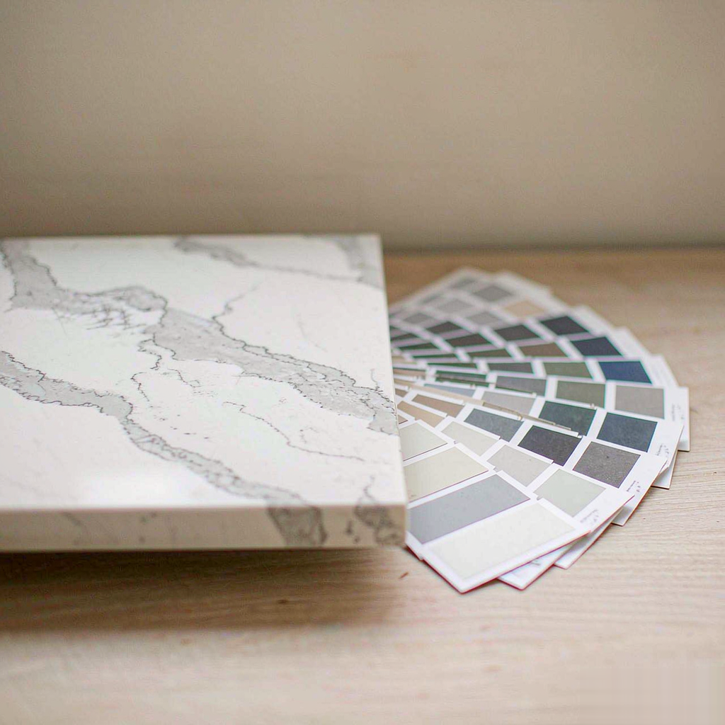
The selection ritual that prevents expensive mistakes: slab sample, swatch fan, real light.
Wood Tones and Warm Metals: The Third Material
Wood is the pairing that needs no LRV arithmetic, because it contributes texture and hue rather than a competing value. Pale oak (effectively LRV 55–70 with grain) keeps the kitchen Scandinavian; walnut and smoked oak go darker (LRV 15–35) and carry the same contrast logic as navy with more warmth. Wood supplies exactly what a cool white-and-grey stone lacks — organic warmth — while the stone prevents the scheme from sliding fully warm, so the two materials do opposite jobs in one composition. BHG’s white-kitchen gallery returns to this formula repeatedly, pairing wood islands and floors with white quartz tops to keep all-white rooms from feeling sterile.
Metal choice finishes the triangle. Warm metals — unlacquered brass, brushed gold — bridge a warm cabinet with the cool stone; cool metals — chrome, polished nickel — extend the slab’s grey into the hardware. Pick one metal temperature and hold it across hardware, tap and lighting: mixing warm and cool metals in a two-colour kitchen reads as indecision at showroom distance.
Three Mistakes That Make Carrara Look Cheap — and the Sampling Protocol
After the rules, the failure modes. Each of these is common enough that I can picture the showroom photo:
- The yellow-tinted white cabinet. Covered above, and worth repeating because it is the number-one offender: cream against a near-neutral stone dirties the veining. Test b* if the paint brand publishes it — stay at or below +1 for cabinet whites beside Carrara.
- The LRV collision. A cabinet grey whose value matches the veining (L* 45–65 territory) makes the pattern vanish into the cabinetry at eye level. Keep the gap honest: 15–30 points to the stone’s ground, clear space from the vein value.
- Dark everything, lit once. Black cabinets, dark floors, one ceiling fixture. The slab reads grey, the veining muddies, and the client blames the stone. Layer the lighting — 3000 K general, task under the uppers, and accents that graze the counter surface.
The protocol that prevents all three: get a real slab sample (minimum 300×300 mm — a chip hides pattern scale), order A4 drawdowns of your shortlisted colors, and live with them on the actual wall for three days. Judge the pair under both daylight and 3000 K evening light, morning and night, because a scheme that only works at noon is a scheme that disappoints 260 evenings a year — then photograph the sample and swatch together, since the camera exaggerates undertone clashes your eye forgives. If the combination survives the photo, order with confidence. For daily-life practicality, the non-porous quartz slab behaviour of engineered stone is the other reason specifiers keep choosing it over marble in working kitchens — spills sit on the surface rather than soaking in.
Frequently Asked Questions
What is the safest cabinet color with Carrara quartz?
Should cabinets be lighter or darker than a Carrara quartz countertop?
Do white cabinets make Carrara quartz look dirty?
Is navy too dark for a small kitchen with white stone?
How do I test cabinet colors against Carrara quartz before painting?
Does Carrara quartz go with wooden cabinets?
Choose Two Numbers, Then the Color
Cabinet color for a Carrara quartz kitchen is not a taste question; it is an undertone question and an LRV-gap question. Match the slab’s near-neutral, slightly cool character, keep 15–30 points of lightness between cabinet and stone (or go deliberately tone-on-tone within 8–10), and any of the six families in this brief will hold up — whites for brightness, greys and greige for architecture, navy and black for drama, sage and wood for warmth. Then test in real light, at real scale, before anything is painted. If you are selecting stone and cabinetry together, tell us the cabinet color and its LRV if the paint brand publishes it: we will send physical samples from the lots whose readings sit best against it — request Carrara quartz samples here.
Post time: Nov-06-2026