
By Alex Wang, International Business Director, Apex Quartz Stone | October 27, 2026 | 12-minute read
TL;DR
- Match the vein to the volume: bold Calacatta veins of 20–80 mm belong on islands longer than 2.4 m, while islands under 1.8 m look best with hairline veining under 2 mm.
- Run the vein along the island’s long axis and fold it down a bookmatched waterfall — a 3200×1600 mm jumbo slab covers most tops up to about 3.0×1.2 m, and a one-sided waterfall usually still fits within one slab.
- Pair cabinets by undertone rather than by “beige on beige”: gold-veined Calacatta wants warm greige and honey woods, grey-veined Calacatta wants cool whites and stainless.
- Frame the stone with a 3–6 mm eased or pencil edge, and light it with 3000 K, CRI 90+ pendants spaced evenly along the run.
- Before cutting, send a six-point brief — dimensions, vein direction, waterfall sides, edge, cutouts and reserved lot numbers — so the design survives the fabrication shop.
A Calacatta quartz kitchen island works when three decisions are made in the right order: vein scale first, vein direction second, everything else third. Get the scale wrong and nothing else rescues the room — a 60 mm gold vein across a 1.2 m island reads as a stripe, while the same vein across a 3.0 m island reads as art. The island is also the most demanding piece of real estate in the kitchen: it is the largest continuous run of stone in the home, it is viewed from more angles than any perimeter counter, and it carries the design’s only real canvas. Calacatta — the white-ground, bold-veined look modelled on the famous Italian marble, rendered here in engineered quartz: roughly 90% grains of quartz, the silicon dioxide mineral that Britannica ranks among Earth’s most abundant, bound with 6–10% resin — is the colorway that rewards doing this properly.
I spend my days between our factory in Shuitou and the designers and importers who buy from it, and the island orders that go wrong almost never go wrong on quality. They go wrong on the spec. So this article is deliberately a working guide, not a gallery: six design plays, the slab math behind them, and the brief you send before anyone touches a saw.
Why Does the Island Decide the Whole Kitchen?
Because the island is the room’s anchor, in three specific ways. It is the largest single stone surface — a typical 2.4×1.2 m top is about 2.9 m², larger than any one run of perimeter countertop. It sits in the middle of the floor plan, so it is seen from the entry, the sofa and the dining table, under three different lighting conditions. And it is the surface people actually touch and gather around. Perimeter counters are the walls of the kitchen; the island is its painting, which is why the patterned stone belongs there first.
That is also why budget concentrates there. Installed quartz runs $50 to $200+ per square foot in 2026 depending on grade, with premier vein-forward patterns at the top of the range, according to Fixr’s 2026 cost data — and the island is usually the one place a premium Calacatta Calacatta quartz slab justifies its price, because it is seen by every visitor and used every day. The perimeter, meanwhile, can stay quiet and cheaper. The classic modern composition is a veined island on plain white counters — the reverse rarely works.
Play One: Scale the Vein to the Island
Vein scale is measured, not felt. Calacatta vein widths fall into three working bands — hairline under 2 mm, mid-range 5–15 mm, and statement veins from 20 mm up to 80 mm — and each band has an island length where it behaves. Statement veins need room to travel: on islands longer than 2.4 m, a 40–60 mm gold vein arcs across the top like brushwork, because the vein occupies only a small fraction of the 2–3 m sightline and the white ground has space to breathe around it.
Below about 1.8 m, the same vein starts to dominate: a 60 mm vein on a 1.2 m top covers 5% of the island’s width in a single stroke, and the eye stops seeing “white marble with movement” and starts seeing “stripe”. In compact kitchens, choose hairline or soft-grey Calacatta with veins under 2 mm — at that scale, veining reads as texture, closer to a brushed plaster than a pattern. Because vein width is the loudest variable in a Calacatta slab, the correct order of decisions is island length first, vein band second, colorway third — never the other way round.
The mid band, 5–15 mm, is the compromise zone and the one most designers default to for 1.8–2.4 m islands: visible movement from the breakfast stool, calm from the doorway.
Play Two: Run the Vein the Long Way — and Fold It Down the Waterfall
Direction is the cheapest design move available, because it costs nothing but thought. Veins running along the island’s long axis make the island read longer, and veins crossing the short axis make it read blocky — so in nearly every modern kitchen, the answer is to run the vein with the room’s main sightline. Stand at the kitchen entry and note which edge of the island you see first; that is the direction the veining should flow, because the slab is composed for the approach, not for the plan drawing.
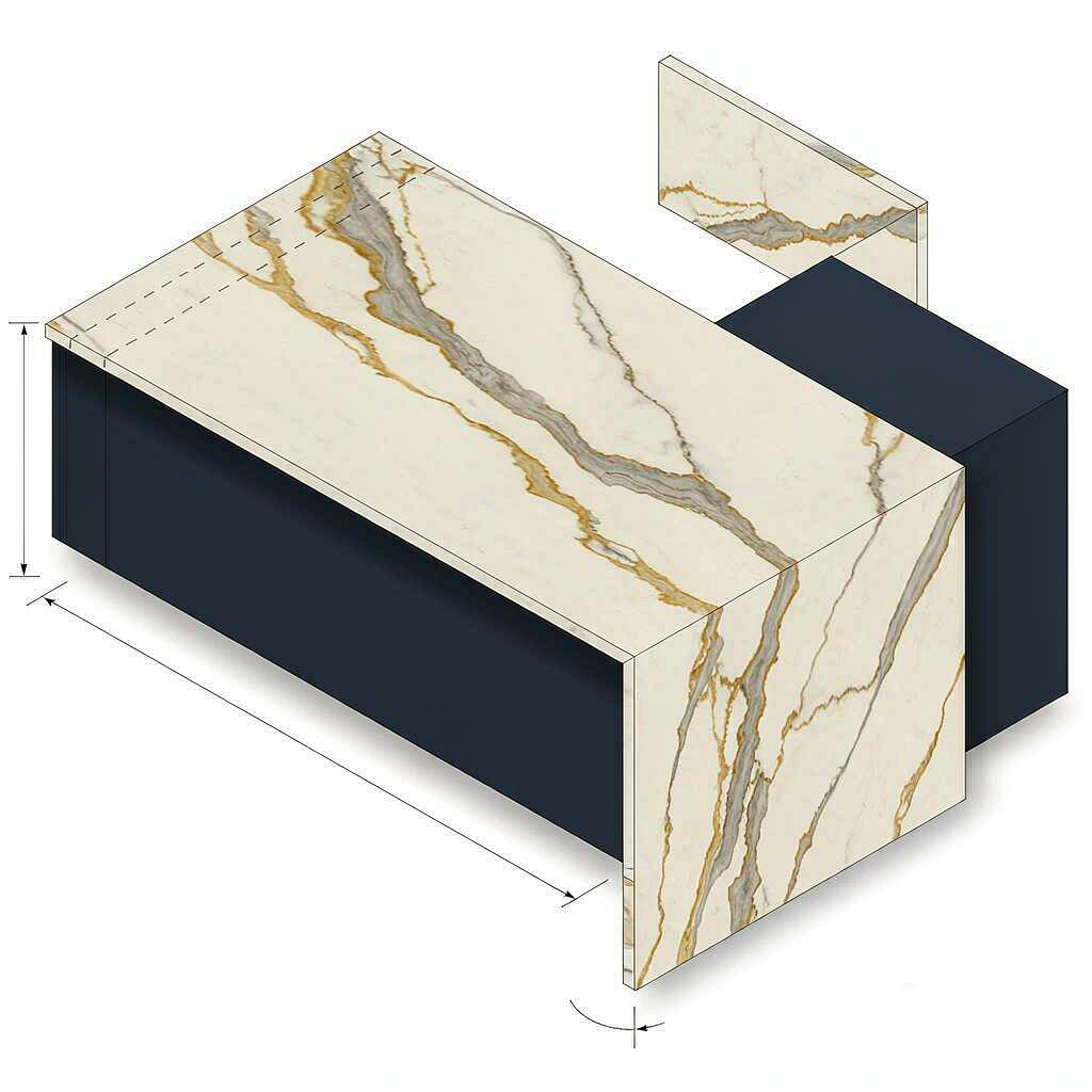
Where the island has a waterfall — stone folding down one or both ends to the floor — direction becomes continuity. The goal is a vein that travels across the top and continues down the panel like a river over an edge, which is why fabricators miter the fold at 45° and match the pattern across the joint. This is also where a bookmatch earns its cost: two consecutive slabs opened like book pages mirror each other, so the fold at the waterfall corner continues the vein almost seamlessly. A bookmatched waterfall needs consecutive slabs from one production lot, so the pair has to be reserved before fabrication — within a good lot, colour difference is controlled to ΔE 1.0 or less, and that is what makes the mirror read as one stone.
One caution from the fabrication world: a waterfall down both ends consumes an extra 1.1 m² of stone and doubles the number of miter joints a fabricator must invisibly match. On islands shorter than 2.0 m, one waterfall is usually the better composition; two can enclose the island like a box.
Play Three: Let One Slab Own the Room
The strongest island is a single-slab island, and the arithmetic is kinder than most people expect. A 3200×1600 mm jumbo slab gives 5.12 m² of stone — enough to cover a 3.0×1.2 m island top with overhangs (3.6 m²) and still yield one 0.55 m² waterfall panel, so the majority of real islands fit inside a single slab. Across roughly 40 island projects we supplied through 2025–2026, 34 left our plant as one-slab tops; the other six went over two slabs because a waterfall ran down both ends or the designer demanded a specific grain direction that forced a second piece.
Where two slabs must meet — longer islands, L-shaped tops — the seam belongs on the diagonal of the vein, where a break in pattern hides best, and both slabs should come from the same lot. The seam craft itself is a fabricator conversation; from the design side, the rule is simply that fewer seams beats prettier slabs, because a visible joint on a bold Calacatta interrupts the vein exactly where the eye follows it.
Play Four: Pair Cabinets by Undertone, Not by Beige
Calacatta’s white is never neutral white — it runs either warm (cream-to-gold ground, gold veins) or cool (blue-white ground, grey veins), and cabinet colour has to follow that undertone. Gold-veined Calacatta pairs with warm greige, honey oak and brass hardware; grey-veined Calacatta pairs with cool whites, stainless and soft blue-grey paints — and mismatching the undertone makes both the stone and the cabinets look slightly dirty. This is the same contrast logic Better Homes & Gardens applies to painted islands: shades drawn from one colour family in differing values keep a large island from feeling heavy.
| Calacatta type | Vein band | Cabinet pairing that works | Pairing to avoid |
|---|---|---|---|
| Gold-ground, bold gold veins | 20–80 mm | Warm greige, walnut, unlacquered brass | Blue-white cabinets (grey cast on the gold) |
| Cool white, grey hairline veins | under 2 mm | Cool whites, stainless, matte black taps | Cream/ivory cabinets (yellow cast on the white) |
| Gold-and-grey blend | 5–15 mm | Soft sage, oak, brushed nickel | High-gloss saturated cabinet colours |
| Dramatic dark veins | 20–80 mm | Deep navy or charcoal-painted island base | Busy patterned floors competing at vein scale |
Floors count as cabinets here: a grey-oiled oak floor will pull the grey out of a blended Calacatta, while a warm cherry floor fights it. Because undertone is a lighting effect as much as a pigment, approve the slab and the cabinet door side by side under the kitchen’s own LED light, not under a showroom’s 4000 K tubes.
Play Five: Choose the Edge Like a Picture Frame
The edge is the quarter-second impression before the eye reaches the veining, so it should either disappear or echo — never advertise. A 3–6 mm eased or pencil edge is the modern default on Calacatta: it reads as a clean line, hides nothing, and costs nothing extra. Ornate profiles do the opposite: ogee and Dupont edges carry a sculptural shadow line that competes with a 50 mm vein, and they cost real money — about $30–60 per linear foot for ogee or Dupont, with decorative edges adding up to roughly $1,050 on a standard kitchen per Fixr’s 2026 pricing.
The one elaborate edge that suits Calacatta is the mitered build-up: a 20 mm slab assembled to a 40–60 mm profile with the vein continued down the face. It is the trick behind every “thick stone slab” photographed in interiors magazines, and it works precisely because the edge is generated from the slab’s own pattern rather than applied to it. Because a mitered edge wraps the vein, reserve the matching strip from the same slab during templating — the look is impossible to fake with a second slab.
Play Six: Light the Island Like a Gallery Piece
Veins are topography, and topography only exists where there is light. Two or three pendants at 3000 K with CRI 90+ render Calacatta’s white as warm and its gold as gold; the same island under 6500 K daylight tubes looks clinical, and the veining flat. Spacing is arithmetic: for two pendants over an L-metre island, divide the run into three and hang at the one-third and two-third points; for three, divide into quarters. Hang them 75–90 cm above the top so the light grazes rather than floods — a shallow angle exaggerates the vein, which is exactly what a statement Calacatta wants and exactly what a hairline slab should avoid.
The finishing touch is the waterfall panel: a 2700 K strip tucked under the counter overhang washes the stone’s vertical face at night and turns the fold into a lantern. It costs a few dollars of LED channel and it is the single most-photographed detail in the island installs I see at our export partners’ showrooms.
Small Kitchens: Does a Calacatta Island Still Make Sense?
Yes — with the volume turned down, not off. A compact 1.2–1.5 m island in a Calacatta hairline or soft grey still delivers the “one beautiful stone” effect, because the island only needs to be the prettiest object in a small kitchen, not the biggest. Better Homes & Gardens’ small-space island guide makes the same point from the furniture side — slim islands with open bases keep small rooms feeling light, and a 20 mm eased-edge stone on a legged base borrows that lightness.
The rules that change below 1.8 m: skip the waterfall (enclosing two sides of a small island shrinks the room), keep the edge eased rather than mitered, and hold pendant count to one or two small shades. The rules that never change: consecutive slabs from one lot, vein along the sightline, and a non-porous quartz slab wipe-clean surface — small islands work harder per square metre than large ones, usually doubling as prep bench, dining table and dumping ground.
What to Send Your Fabricator Before Anyone Cuts
Every failed island spec I have seen traces back to a missing line in the original brief. Six items prevent almost all of them:
- Finished dimensions with overhangs — the stone’s size, not the cabinet’s: a 2.4 m cabinet island with a 30 cm seating overhang is a 2.9 m stone order.
- Vein direction and the entry view — one sentence and a phone photo of the room from the doorway beat a hundred words of “dynamic movement”.
- Waterfall sides and bookmatch yes/no — this decides the slab count and the reservation before anything else.
- Edge profile and target thickness — eased 3–6 mm, mitered 40 mm, or otherwise, with the matching strip reserved on the miter.
- Cutout positions relative to veining — a sink cutout through the slab’s densest vein patch is the most common and most avoidable regret.
- Reserved lot and slab serials — the same production lot, consecutive slabs, written into the order; for custom sizes, our Calacatta white quartz countertops program cuts and photo-approves each slab before shipment so the file and the stone agree.
Frequently Asked Questions
Design First, Then Shop the Slab
The best Calacatta islands are not bought — they are specified. Decide vein scale, direction, waterfall, edge and light before you open a slab inventory, because a well-briefed order turns a good colorway into a designed kitchen, while an unbriefed order just puts expensive stone in the middle of the floor. The six plays above fit on one page; that page is worth more than any catalog.
When you are ready to reserve, send us your island brief with the Calacatta quartz slab spec — dimensions, vein band, waterfall sides and edge — and we will confirm slab availability from current lots, send vein-direction photos of the exact slabs, and hold consecutive pairs for bookmatched projects before your fabricator commits.
Post time: Oct-30-2026